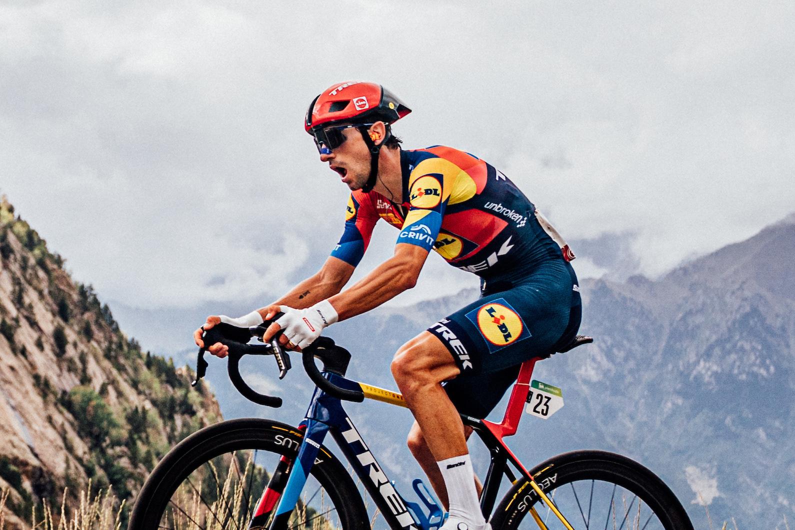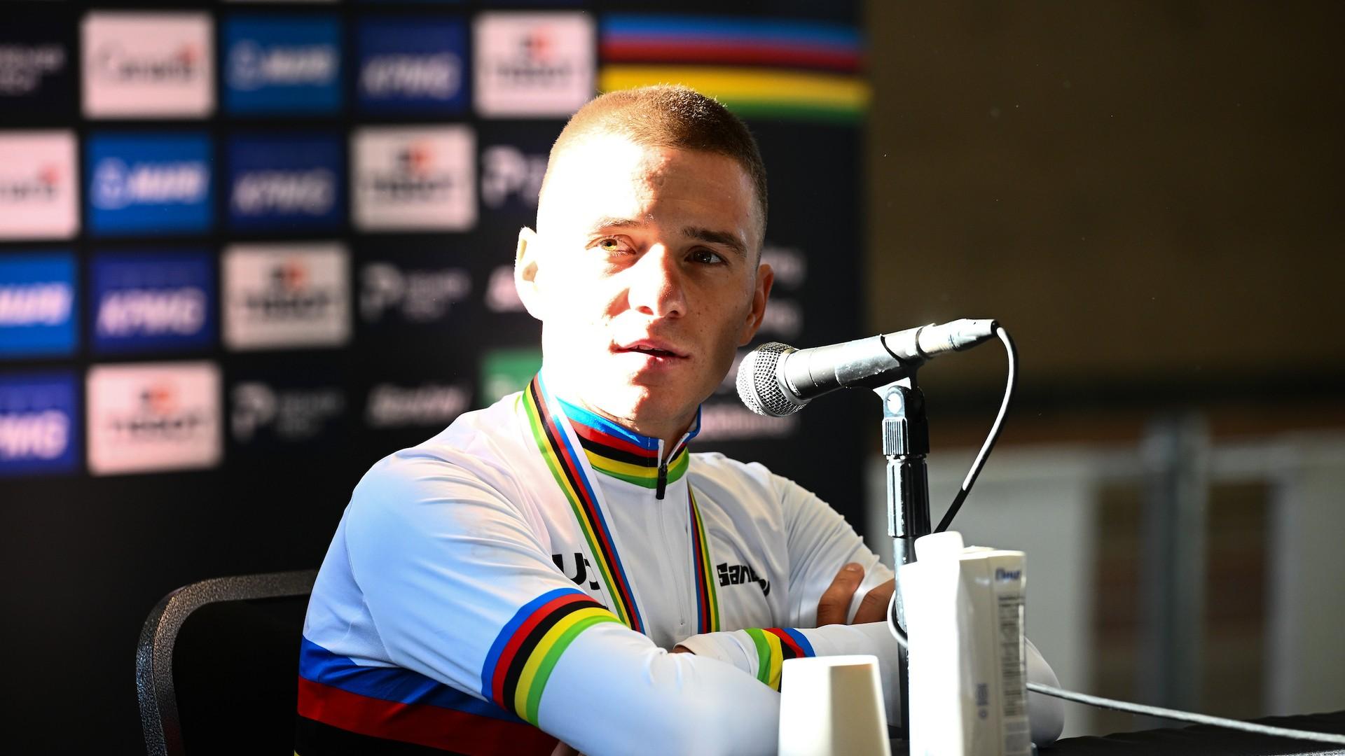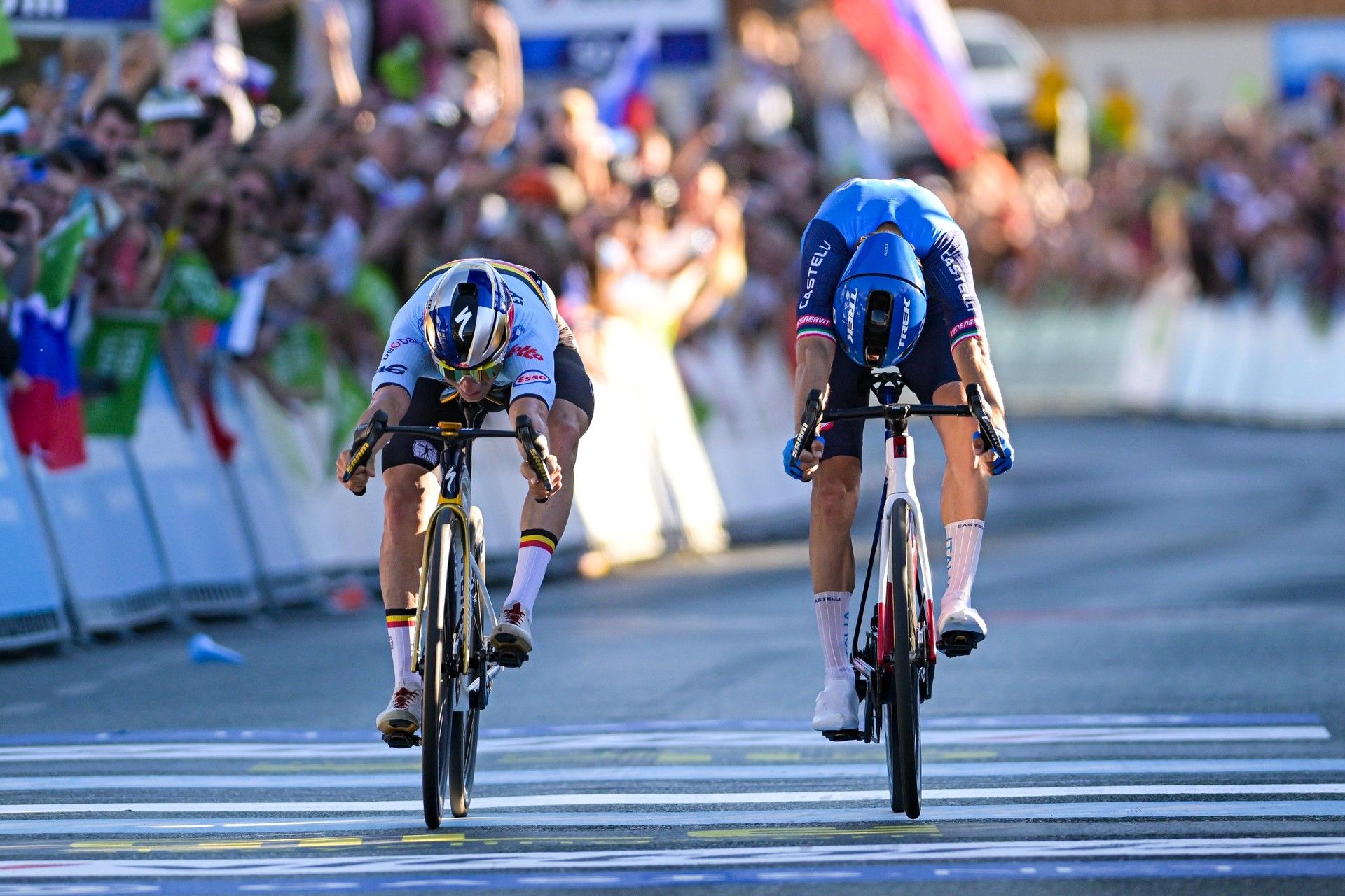
Remco Evenepoel (Red Bull-Bora-Hansgrohe), racing for Belgium, beat Giulio Ciccone (Lidl-Trek), racing for Italy, in a photo finish at the European Championships in Slovenia on October 4. The UEC described the winning margin as “just a few centimetres”, and the cycling internet erupted in debate.
The finish prompted questions on social media about the bikes’ strange proportions. In his explanation on X, cyclist and photographer Lukáš Ronald Lukács said commenters had asked why Ciccone’s bike looked so small and Evenepoel’s so long. The answer lies in how the finish image is assembled.
A line-scan photo finish builds its picture from successive moments at the finish line, with time running horizontally across the image.
Instead of photographing the whole sprint at once, the camera repeatedly records one thin slice at the finish line. It places those slices side by side to build the image.
Each part of a bike appears as it crosses the line: first the front wheel, then the frame, then the rear wheel. Across the image, you are reading successive moments, not distances along the road.
To find the winner, compare the leading edges of the front tyres. The rider whose front tyre reaches the line first wins, regardless of whose head, hands or handlebars appear ahead.
The 2021 Amstel Gold Race shows why the camera’s alignment matters too. Wout van Aert was awarded victory over Tom Pidcock after a photo finish, but subsequent claims that the camera had been incorrectly positioned fuelled debate over the result. That is a separate issue from distorted-looking bikes: recording successive slices explains the strange shapes, while correct alignment ensures those slices capture the finish line.
Why wheels and bikes look distorted
A wheel keeps rotating while the camera assembles those slices. Its outline and spokes are being recorded over a period of time, rather than frozen together at one instant.
Each spoke changes position as the wheel turns through the finish plane. The camera joins successive views of that movement into one time-based image, producing shapes that can look unfamiliar.
A bicycle’s apparent length also depends on how it moves through the scan. A slower passage takes more time between the arrival of the front and rear wheels, occupying more of the image’s horizontal axis. A faster passage takes less time. Two bicycles with similar dimensions can consequently appear different lengths in the finished strip.
The reason Evenepoel’s bike may seem longer, then, is that a rider who slows after their front tyre crosses the line can appear stretched in the image as the rest of the bike passes through. That does not change which front tyre arrived first.
Why television can give a different impression
A television replay shows the sprint from a camera’s position and angle. Perspective affects how the riders line up in that view, while the selected video frame determines which moment the viewer sees. In a very close finish, those details can change the apparent order.
A replay is useful for following the acceleration, positioning and bike throws. A properly aligned photo-finish system answers the narrower question of which front tyre reached the finish plane first, recording successive moments at that precise location.
Finishing order and an exact numerical margin are also separate questions. An AI-assisted calculation published by AS put the gap at about 0.00028 seconds, using a sampling rate of approximately 3,500 frames per second. That rate has not been confirmed for this finish, and the estimate is not an official timing figure. The published classification gives Ciccone “s.t.”, meaning the same time as Evenepoel for the results table, rather than a measured zero gap.
Belgian coach Serge Pauwels watched television images of the finish in the team car.
“Actually I thought we lost because we had images of TV in the car,” Pauwels said. “I couldn't believe it, even when I saw the TV images. I mean it was really close.”